Abstract
Dashboard
Data
The core data source was PubMed, which I accessed programmatically via Entrez Direct and Bio.Entrez. The query searched for ‘NMR’, ‘Nuclear Magnetic Resonance’ or ‘N.M.R.’ (case insensitive) in the title or abstract with filters on publication date between 2000/01/01 – 2024/12/31 and exclusion of preprints and non-English language articles. The key information fetched from PubMed for the scope of this project were:
| PMID | Publication year | Journal title | Article title |
|---|
Another data source used to complement the records fetched from PubMed was OpenAlex, accessed via pyalex API wrapper. The complementary information fetched from OpenAlex included the following:
| Citations count | Authorships | Open access | Referenced works |
|---|
The data from both sources were combined, preprocessed in the pandas dataframe and saved as an SQLite database for use in the dashboard app.
Methods
Interactive dashboard has been built using Dash. The main component of the dashboard – an interactive world map – was created using Dash Leaflet (a wrapper for Java Script Leaflet). The country-specific plots on the right-hand side of the dashboard were created using Plotly. The Geojson world map is from Natural Earth data (public domain data).
The dash app employs callbacks that trigger different SQL queries dynamically based on the user-selected dropdown options and years range (bottom slider).
Since the map displays data averaged over the selected year range for all countries, some countries with few papers (poor statistics) can strongly affect the color scale. Therefore, an extra option to exclude countries below fixed number of papers (user-defined) has been introduced (default: 100 papers). The conditions for assigning the paper to a country were as follow, checked in the hierarchical order:
- Select the country with the most frequently occurring affiliation for all authors of the paper.
- If the country of the last author is one of the countries having a tie, select the last author’s country.
- If the country of the last author can’t resolve a tie and if the country of the first author is one of the countries having a tie, select the first author’s country.
If any of these rules could not assign a country to a paper, the paper was classified as ‘Multinational‘. The above set of rules allowed the assignment of countries to ca. 187,000 records (97.5%).
Example dashboard visualizations
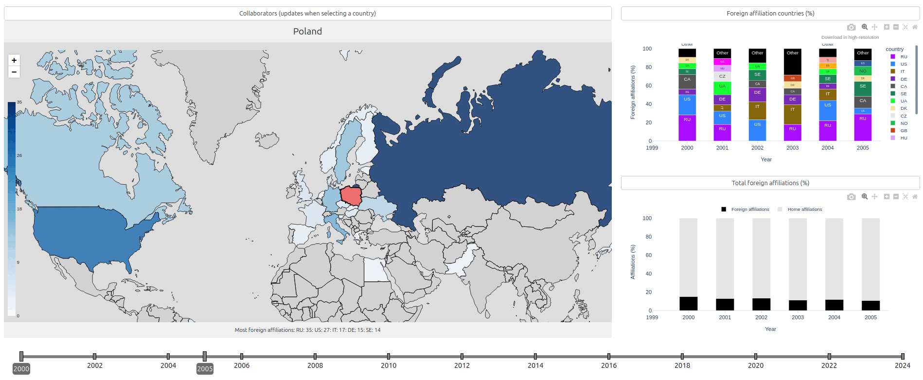
The change of collaborators for Poland over time.
In the early 2000s, Poland most frequently collaborated with Russia, but this changed over time in favor of collaborations with the USA and Western European countries, particularly Germany and Great Britain.
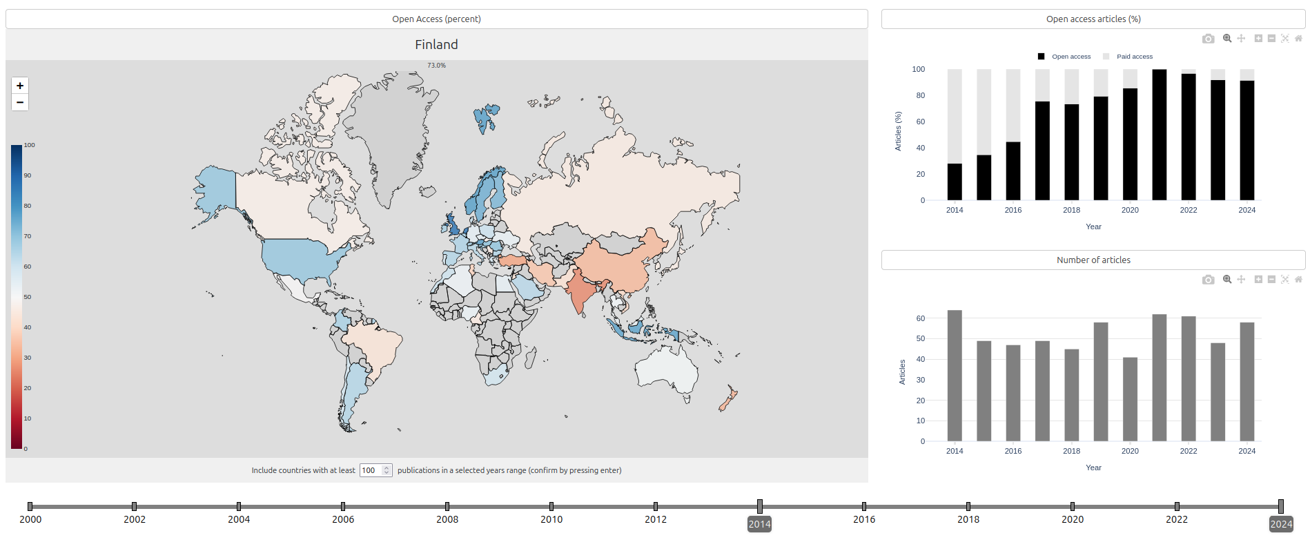
Publishing in open access in years 2014-2024.
The visualization shows the percentage of open-access papers published by different countries between 2014 and 2024. There is a clear difference between China (33.6%) or India (25.8%) and the West (above 50%). This gap increases rapidly when only the most recent data is included. For example, look at the case of Finland, where the open-access level increased from around 30% in 2014 to above 80% in 2020 (top-right chart). This trend is common for most EU countries, while China and India do not follow this trend. The map also highlights that the Scandinavian countries have the highest percentage of open-access papers (papers mentioning NMR spectroscopy).
Project repository
Dashboard
The complete code for the dashboard is available in the public repository:
https://github.com/dgolowicz/bibliometrics_NMR
Database
Important: The dashboard repository does not include the database file. However, one can create one by using scripts from this complementary repository:
https://github.com/dgolowicz/bibliometrics_NMR_data_prep
Please note that this process includes fetching data from PubMed and OpenAlex and may be lengthy. For NCBI (PubMed), it is recommended to download data on “either weekends or between 9:00 PM and 5:00 AM Eastern time during weekdays“. Also, you should not exceed three requests per second (without API) or ten requests per second (with API key). An API key can be easily generated at https://account.ncbi.nlm.nih.gov/settings/).
Legal notices
Data Sources
This dashboard application utilizes data retrieved on March 15, 2025, from the following sources:
- PubMed: Including metadata fields such as PMID, publication year, journal title, and article title.
- OpenAlex: Including metadata fields such as citation count, authorships, open access status, and referenced works.
The retrieved data has been cleansed and transformed to suit the requirements of this dashboard application. Consequently, visualizations may not reflect the current state of the original databases and may differ from the source data due to these processing steps.
Licensing
This work is dedicated to the public domain under the Creative Commons Zero (CC0) 1.0 Universal Public Domain Dedication. To the extent possible under law, the author has waived all copyright and related or neighboring rights to this work.